Shared Lines
Pen and Pencil as Trace
Gerard Curtis
Tennyson, in a poetic tribute to his friend the writer and artist Edward Lear, writes:
all things fair,
With such a pencil, such a pen,
You shadow forth to distant men,
I read and felt that I was there.[1]
Tennyson's tribute makes an essential association between the pen and the pencil, partners in a single act, and the "trace" they leave, which provides a visible imprint of the author's imagination. George Cruikshank's joint portrait of himself and the reforming pamphleteer William Hone, done in 1827 (Fig. 7), provides another vivid image of this partnership. Hone and Cruikshank are seated at a desk in a position of mutual respect and understanding; both are in the act of scribing with pen and pencil (Cruikshank also has an engraving tool beside him). Writer and artist have equal weight in what are seen as analogous activities.
In today's computer age (with the binary code as its root system) such emphasis on the drawn line seems merely fanciful; in the Victorian period, "the line," whether drawn or written, functions as a trace that constitutes the sign of meaning. This essay will examine how during the nineteenth century the textual, or written, line came to dominate while the drawn line diminished in value. By the end of the century, a number of artists felt that the basis of their partnership with writers had dissolved. They battled to reassert the value of the graphic line, a battle reflected in Cruikshank's polemic attack on William Harrison Ainsworth and Charles Dickens in The Artist and the Author (1871–72), in
which Cruikshank claims he was the originator of Ainsworth's Tower of London and Dickens's Oliver Twist .[2]
Two advertisements for elementary textbooks in the original Dickens serials demonstrate the stress the Victorian period placed on the foundational aspect of line.[3] In one, Hannah Bolton's First Drawing Book (advertised in Bleak House, no. 9 [November 1852], p. 3.), drawing (or the drawn line) is seen as aiding the schoolmaster in giving "intelligent assistance to the scholar; and while training the band [emphasis added]," it "will instruct the mind." But even more telling is the advertisement for Elementary Drawing Copy Books (Fig. 8) from Our Mutual Friend . By using this copybook series, students could learn drawing and improve their writing at the same time. The book stresses line as the essential link between writing and drawing, words and image. The book starts by instructing students to copy out the alphabet, so that they learn "the different kinds of lines by drawing Italian letters," and ends by having them draw animals and insects. In these now largely forgotten copybook exercises children, under the guidance of the "writing master," learned the structure of the line.
In these copybooks, textual literacy in elementary education gave rise to visual literacy, and vice versa, through a common source in line.[4] Such a linking of text and image was necessary in a period when the records of commerce depended upon the skills of fine penmanship. Advertisements throughout the century helped promote these skills, essential to banking, legal copying, domestic accounts, general accounting, communication, record keeping, and self-advancement. The Domestic CopyBook for Girls taught the proper woman's hand for writing letters, order forms, and housekeeping accounts, while other guides, such as Business Writing and Pitman's Commercial copy Books, taught a masculine hand for commercial work. Gilbert Malcolm Sproat noted in his 1870 text Education of the Rural Poor that the primary skill to be taught in school, above even reading and arithmetic, was writing: "good handwriting is perhaps the most immediately valuable accomplishment for middle-class boys at their start in life."[5] Robert Braithwaite Martineau's painting of 1852, entitled Kit's Writing Lesson (Fig. 9), visually illustrates this point, with Kit (from Dickens's Old Curiosity Shop ) shown laboring over a copybook, doggedly attempting to imitate fine lettering and thus develop that prerequisite to success, an accomplished "hand."[6]
The first volume of The Universal Instructor; or, Self Culture for All (1880–84) carried a series of articles on penmanship, and the proper training of hand and eye in writing. It mentions that a good hand means much, and it teaches decorative penmanship. The third volume contains
a number of articles on drawing. The first of these begins with the essentials of line work, grounded in geometry and the straight line. The articles progress to shading and then to color.[7]The Universal Instructor thus saw both penmanship and drawing as skills necessary for self-education, self-culture.
In turn, drawing was seen as an essential skill for mechanics, draftsmen, artisans, navigators, and engineers for use in mapmaking, topographic drawing (taught to cadets and military officers for intelligence and geographic purposes), and scientific illustration. Technical and commercial success for the empire was linked, in the late eighteenth and nineteenth centuries, to the skillful training of designers in drawing schools.[8] Drawing was taught at workingmen's colleges, where artists like Lowes Dickinson, Rossetti, Ruskin (who had compiled a text of botanical illustrations), and Ford Madox Brown served as instructors. William Blake, whose works exemplify the conflation of drawn and written lines, and who developed a process for printing intertwined script and engravings from the same etched copper plate instead of from set type, trained in a drawing school that stressed commercial design and graphics.[9]
In more practical ways the links between writing and drawing were constantly reinforced in the Victorian city environment. Signwriters delineated text in public spaces, filling in the hand-formed letters with paint and fancy scrollwork. The signwriter (who became largely obsolete with shop-produced stenciled signs) demonstrated that writing was in fact a livelihood.[10] In the London streets the role of the hand in writing was made public in unique ways. Henry Mayhew, in London Labour and the London Poor, recounts the life of a "Writer without Hands" who plied the streets chalking out biblical script with his stumps to earn a living.[11]
The partnership of the textual and pictorial line, begun in the Penny Illustrated Magazine, culminated in the Illustrated London News, one of the great cultural achievements of the Victorian period, as Martin Meisel rightly notes.[12] In its own advertisements of the period the Illustrated London News noted this accomplishment; it "wedded art unto the Press . . . / By pictured paths the eye is lead/ To places where its fruits have birth/ . . . Art by reflection brings to view all the brains inventions." The poem goes on to state that art's pencil shall "shed luster on the pen."[13] In 1844 William Andrew Chatto noted that the process of engraving, used to illustrate the news, had given the "very age and body of the time, its form and pressure."[14] Chatto explains how the age has
been shaped by connecting the woodblock line to the press. The pun on "pressure" further links the two, with both characterized by the action of pressing and imprinting. John Ruskin, in his "Academy Notes, 1875," claimed that "our press illustration, in its highest ranks, far surpasses—or indeed, in that department finds no rivalship in—the schools of classical art."[15]
A letter from a nineteenth-century teacher stresses the value of the drawn line as both a technical skill and an aid to develop the poetical and imaginative eye of the child in school. Having just discussed maps as an educational tool—a tool, we should note, that casually unites image and text—the teacher states:
By these and other means we attempt to enrich and cultivate the minds, the hearts, the imaginations of our boys. "What!" some will say, "cultivate the imagination of peasants! What have they to do with imagination?" They have to do with it because the Almighty has bestowed it. . . . You know that we teach in our schools the elements of lineal drawing. Beside this, I encourage, by gifts of pencils and blank books, any of our boarders who has a turn for drawing, to amuse himself by sketching from nature. . . . Now I do not want to make of them artists . . . ; but I wish them to look on nature with a religious—nay, with a poetical eye.[16]
In the eighteenth century the unity of textual and pictorial line was the province of the writing master, as in William Chinnery's Writing and Drawing Made Easy (c. 1750) or George Bickham's Drawing and Writing Tutor; or, An alluring introduction to the study of those sister arts. Containing examples, both in penmanship and in drawing, etc. (Fig. 10). As Bickham's subtitle suggests, writing and drawing join the "sister arts." George Bickham and his son published a number of books on penmanship, and in their works the student learned, through repetitive exercises, skills like calligraphic striking and how to turn line into a decorative motif. Examples of nineteenth-century children's penmanship books show how calligraphic flourishes could be used to devise pictures and drawings of animals.[17] Educational training in the eighteenth and early nineteenth century stressed, through such exercises, the aesthetics of a written graphic line that easily flowed between text and image. Highlighting these ties were works like John Hemm's 1831 Portraits of the Royal Family in Calligraphy (Fig. 11). It consisted of a series of drawn royal portraits, with the clothing, surroundings, and name formed from a swirl of calligraphic pen strokes and "strikings."[18]
In his Curiosities of Literature, Isaac Disraeli complained that writing masters (like Hemm, one assumes), through their exuberant line work, were claiming a place at the Royal Academy as artists. Like engravers
(who were fighting a similar battle for recognition), writing masters, according to Disraeli, believed that they ranked with the painter and sculptor,[19] reflecting in their own eyes the true value of the graphic line in the nineteenth century.[20]
In Line and Form, Walter Crane claimed that "Line [w]as a Language," capable of expressing movement, force, action; recording natural fact; and appealing to the emotions.[21] According to Crane, the forming of letters was good practice for drawing:
Writing, after all, is but a simpler form of drawing, and we know that the letters of our alphabet were originally pictures or symbols. The main difference is that writing stops short with the acquisition of the purely useful power of forming letters and words, and it is seldom pursued for the sake of its beauty or artistic qualities as formerly: while drawing continually leads on to new difficulties to be conquered, to new subtleties of line.[22]
Crane here privileges the drawn line over the simpler written line, going on to note the essential links between them when he says that
Letters can be taken as the simplest form of definition by means of line. They have been reduced through centuries of use from their primitive hieroglyphic forms to their present arbitrary and fixed types, though even these fixed types are subject to the variation produced by changes of taste and "fancy."[23]
Kate Field's Pen Photographs of Dickens' Speeches attempts with the pen what the photograph was achieving in visual communication, for in this work she uses line and text to convey the power and intonation of Dickens's dramatic readings of his own novels. She links blocks of text to each other with diagonal lines to indicate rising and falling vocal patterns, to create almost a musical scoring of speech. In 1864 Alexander Melville Bell devised a system of what he called visible speech, in which pictures, accompanied by diagrams, indicated a series of mouth and breath patterns (Fig. 12). These pictures allowed one to learn languages purely through mouth positions and breathing. (The young Alexander Graham Bell learned Mohawk this way.)[24]
Dickens's serials contained a number of advertisements for penmanship courses, lessons that would teach professional business and writing hands to those who needed them (Fig. 13). In the example I have chosen, a hand holding a quill is poised above paper in the act of writing. This image is repeated in numerous self-portraits of artists and countless portraits of authors whose "hand" is pictured at a similar moment.[25] The very business of the British Empire turned on the traces left by these "hands": mechanical diagrams, engravings, illustrated logbooks,
drawings from expedition artists (in Wilkie Collins's Woman in White, Hartwright, the drawing master, leaves England as an expedition artist), church script, shorthand (for which there were specialized journals, some containing examples of Dickens's own shorthand script), the writing in accounting books, export and import accounts, governmental and legal documents (done in their own legal script). The writing and drawing master taught these new scribes of the empire to record in pen and pencil the very accounts, records, and images that fed and nourished it.
As if to insist on the importance of script, Dickens in his novels stresses the power of the written line over the printed typeset line. In Bleak House, for example, a letter in legal script to Esther Summerson is reproduced, giving the documentation added import and relevance. In the serial version of Sketches by Boz, sections of handwritten "official" script were used in an advertisement, placed by Dickens, to authenticate the legality of his warning to piraters of his novels. Wilkie Collins uses similar "hand"-scripted passages in The Woman in White for a death certificate and a tombstone inscription.[26]
The linking of penmanship and drawing extended beyond illustrated novels and books. The Hudson Bay Company archives contain James Isham's Observations on Hudson's Bay of 1743.[27] Here, on opposing pages are neat penned lines of observations on life around Hudson Bay and "descriptions and illustrations of methods of trapping, weather, and flora and fauna." The illustrations are crude, with only a few colors used, but, like Michael Faraday's later travel logs and scientific notebooks, Isham's book shows how drawing and writing were seen as joint methods of capturing data.
The increase in autograph collecting provides further evidence of the value placed on line in the nineteenth century. The painter W. P. Frith noted the price of fame for artists and writers meant being besieged by autograph seekers; and once an autograph was garnered, it joined others in a parlor table autograph book for the appraisal of the collector's colleagues. What the nineteenth century witnessed was the growth of a popular desire to see and collect these original marks and traces for their cachet value. The Birmingham Journal in 1875 noted how thousands of people lined up outside a bookseller's shop just to see a single page of the manuscript of one of Dickens's novels that was put on display. The Illustrated London News of 1912 reproduced facsimiles of manuscript pages from Edwin Drood and David Copperfield to celebrate the centennial of Dickens's birth, while the Christian Science Monitor reproduced a facsimile letter and signature from Dickens.[28] The manuscript of George
du Maurier's Trilby was eventually placed in a special crystal display case for its many admirers.[29]
In turn-of-the-century publications like Collingwood's Ruskin Relics, aspects of Ruskin's life are represented by incorporating various "lines" within the text: facsimiles of Ruskin's writing, facsimiles of his musical scores and markings, and reproductions of his drawings and maps. Collingwood notes in his introduction that such diffuse elements give a full and rounded picture of Ruskin. John Forster, too, combined various types of line in his Life of Dickens to convey Dickens's character.
Most notable of all these line collections was the short-lived journal the Autographic Mirror (Fig. 14), which displayed facsimiles of musical scores of significant composers, signatures (Dickens's appeared twice), selections of manuscript pages and letters, and drawings by well-known artists. The journal also included Mexican Mixtec codices and their "hieroglyphic signs."[30] Throughout one sees "line" as a collectible and shared commodity, uniting sound, image, and text. Transcending cultural boundaries, as in the Mixtec codices, line becomes a collectible universal communicant. Thomas Webster, R. A., supplied a sketch of his hand and his autograph to the journal, providing "one of his sketches, a hieroglyphic united with his autograph 'Witness my Hand.'"[31]
Philip Hamerton wrote in The Graphic Arts (1882):
All writing, whether careful, or careless, is drawing of some kind. . . . Rapid handwriting is not merely like sketching, it is sketching. The same strong marks of idiosyncrasy which are to be found in the sketches of artists exist in handwriting, and there is the most various beauty in handwriting. It is curious, considering how few people give a thought to these matters. . . . People write legibly or illegibly, elegantly or inelegantly, but they seldom put letters together which do not go well with each other. There are instances of incongruity, but they are rare. In general they are prevented from occurring by the unities of taste and habits which form the identity of each of us, so that we acquire a personal style in penmanship as we do in the use of language.[32]
Hamerton continues:
Suppose that you have to write a letter. You take a sheet of white or toned paper and dip your pen in black ink. You then write away rapidly and your pen leaves the black fluid wherever it has passed in the shape of free lines . What you are really doing all the time is sketching, though you do not think of it under that name. You are sketching the forms of letters, hurriedly and inaccurately, perhaps, but still so that the intended forms are perfectly recognizable by anybody who can read that kind of writing. This pen process
is one of the important forms of graphic art . . . and it is quite an artistic process [emphasis added].[33]
In magazines like Punch, initial letters to articles showed how typographic, written, and drawn lines could be linked in an image (Fig. 15). The covers or title pages of Dickens's serials often combined image and text. The lettering of the title page of Little Dorrit (Fig. 16), done by Phiz, for example, with its chains and bricks, echoes the novel's themes of prison and confinement. Such lettering strengthens the reader's illusion that the printed novel is a manuscript, thus relinking the typography to the original act of writing. Edwin Drood contains a similar use of the illustrator's script as a visual device. Such devices occur in all the serial issues of Dickens's novels, with the illustrator's cover design and the captions (seemingly handwritten) beneath the illustrations reasserting the presence of the graphic hand (echoing what Webster had made graphic through his hieroglyphic hand in the Autographic Mirror ).
In The Clothing of Clio, Stephen Bann has noted how Charles Reade's Cloister and the Hearth (1861) utilizes an illustration of a set of clasped hands within the body of the text. Here the illustrated hands actually break into the middle of a sentence, becoming attached to the reading process, and blending the illustrative and narrative languages operating in the novel.[34] Reade tells us that the hands are there for the illiterate parents in the novel to read. But whereas Bann emphasizes Reade's narrative strategy in uniting the visual sign here with the textual, there is a more fundamental link between the drawn and written line occurring. The illustration is drawn by the same hand as the letters that the parents cannot read.
A critic of the period, in the Saturday Review, noted how the modern illustrated book he was reviewing was part of the new "hieroglyphics" sweeping Victorian society. The initial letters in Punch, Cruikshank's illustrations, the chains and brick in Phiz's lettering for Little Dorrit, illustrated magazines like the Graphic and Cornhill, and Charles Reade's Cloister reveal a "hieroglyphic-pictographic" culture based on a language of ideogram, pictogram, and phonetics (Fig. 17). By the mid nineteenth century, the graphic arts were seen as an extension and evolutionary development of picture writing and the hieroglyph. The social Darwinist Herbert Spencer, as Walter Crane pointed out, praised the English graphic press on this basis.[35]
At this point, I would like to return to Cruikshank and his portrait illustration of himself and Hone. By the latter half of the century the unity he depicted between the drawn and written line had been dis-
rupted.[36] Cruikshank's own polemic article, "The Artist and the Author," provides vivid evidence of this development. Cruikshank claimed for himself a role in originating Dickens's Oliver Twist and Ainsworth's novel The Tower . He claims, not that he has written the novels themselves (as some critics have asserted), but that he was more than a mere illustrator, that he was an equal partner, an artist (as the title "The Artist and The Author" suggests) working with the author, stimulating his visual imagination (for example, showing Dickens models, ideas, and locations central to the story of Oliver Twist ). There is no doubt that early in the century Ainsworth and Dickens had recognized such a partnership with Cruikshank. Ainsworth's Magazine of June 1842 featured an advertising poem celebrating Cruikshank's association with Ainsworth in producing the magazine:
Cruikshank! I do rejoice to see thy name
Reckon'd with Ainsworth's in the roll of fame!
Union most pregnant! that with grace doth bind
In faithfull bonds such pencil and such pen—
Kith bond to kin, and neither less than kind.[37]
In illustrating Dickens's Sketches by Boz, as in the print entitled "Public Dinners," Cruikshank showed both himself and Dickens in the act of observing London life; in another he showed himself and Dickens floating off together in a balloon above their admirers' heads.
It must be remembered that in the first half of the nineteenth century, Dickens started out providing simply the letterpress captions to the then famous artist Robert Seymour's print series the Nimrod Club (which would be taken over by Dickens for his first novel, Pickwick ). As if to verify the importance of the artist to the author at the beginning of the century, Dickens, in his original manuscript of Oliver Twist (Forster Bequest, Victoria and Albert Museum), wrote George Cruikshank's name immediately under his own at the beginning of each division of his manuscript. Dickens's later manuscripts did not feature the illustrator's name so prominently.
Dickens, without success, had advocated that the Royal Academy consider line engraving an art, and Cruikshank its prime representative. An early reviewer of Oliver Twist commented on the joint value of illustrations and text in telling the story, suggesting that Cruikshank be elevated to the Royal Academy on the basis of his engravings. The failure of the Royal Academy to recognize the graphic arts and the graphic artist may have led to the eventual degrading of the medium. More than anything in the century, however, the rise of photography spelled the
end, for with it the engraver slipped from "implied" artist to popular illustrator of mass-market imagery. Line art became, by the end of the century, secondary to the line of literature and the silver halide dots of photography. The subtle paradigmatic shift in the relationship of the written to the drawn line was visually represented by a change in the volume covers of the Illustrated London News . Prior to 1857 Art and Literature are shown hand in hand, surveying the world (Fig. 18 echoes Cruikshank's and William Hone's positions of equality). After 1857 Art is shown as subordinate, behind Literature and looking over her shoulder, to the text, for guidance (Fig. 19 echoes Dickens's textual takeover of Seymour's pictorial Nimrod Club ).
James McNeill Whistler complained in 1888 that contemporary critics and writers on art had gone overboard in viewing art as "more or less a hieroglyph" and in allowing art to be subsumed by literary analysis rather than by artistic and aesthetic merit.[38] Both Henry Blackburn, in 1893, and Joseph Pennell, in 1896, mention the collapsing role of, and the lack of respect for, the pictorial image, illustration, and the graphic artist. For Blackburn and Pennell, photography had become the main competition, mass production of images and the growing importance of the author having further diminished the role of the graphic artist. Because of the hack illustrator, as they noted, the work of the true artist had cheapened.[39]
That photography directly challenged the pencil line is evident from William Henry Fox Talbot's Royal Society talk of 31 January 1839, titled "Some Account of the Art of Photogenic Drawing, " or "the process by which natural objects may be made to delineate themselves without the aid an artist's pencil [emphasis added]." In 1844, when Talbot produced his photographically illustrated text The Pencil of Nature, he inserted a notice to the reader, similarly worded to deny assistance from engravings or "any aid from the artist's pencil."[40] The challenge to the writer's pen would take longer, but it too was on its way. As Alexander Graham Bell was to point out in his effort to develop the phonograph, its invention and perfection would "be a contribution to the world's utilities of little less consequence than the invention of printing."[41] The pen line and type were to have their successor in a device that would capture the voice. The phonograph and photograph, two inventions of the nineteenth century, would thus shift humans, after thousands of years of dependency, away from the drawn and the textual line (whether written or printed).
The challenges to the artist's pencil from photography, hackwork, and the rising importance of the author led, as Blackburn noted, to "the
dragging of our national reputation in the mire "; the deterioration of illustration became a "serious matter."[42] This concern echoes Cruikshank's earlier concerns in "The Artist and the Author," where the writer has gained credit and fame while the position of the artist has diminished. For Blackburn, the art of printing, mass literacy, and the stress on the written hand had led by the 1870s to "some neglect of the art of expressing ourselves pictorially."[43] He further notes how the emphasis on writing has caused children to lose their "freedom and power of expression." With this drawing talent lost, "the [natural] hand is gone forever" and is instead chained to parallel lines of scribing.
What one is left with, then, by the end of the nineteenth century, is the obverse of the illustration of Hone and Cruikshank discussed at the beginning of this essay. The artist was now battling with the author, as in Figure 20, where the two figures are shown standing on the pages of an open book with their respective instruments, the pen and pencil, as giant swords. The winner in the battle of the lines was, as Blackburn had foreseen, the writer; in schooling, the enforced hand of writing won out over drawing. And the illustrator of this fencing image? It was none other than George du Maurier, who had suffered hardship as an illustrator, and who had, at long last (around the time this illustration was published, in fact), achieved financial success and fame as the author of Trilby (a novel where artists are "captured" in print).[44]
Numerous arguments in the late nineteenth century defended drawing as a necessary skill. Mary Barton in 1890 gave priority to drawing over writing in education, feeling that "art should come before literature" since drawing led to writing (she recurred to the analogy of hieroglyphs and picture writing). She adds that art dominates because "Drawing is a Universal language."[45] Barton further notes that "Writing and Drawing are connected in a way that needs no demonstration, although something has yet to be done to bring the fact into practical recognition."[46]
There is no doubt that for Crane, Blackburn, Barton, and Hamerton drawing was a universal language, able to surmount the linguistic limitations of text through what was perceived as the universal iconics of the drawn image, and the self-referential indexicality of the graphic trace. They linked the pictorial with the textual and typographic, giving mark priority over signification, making writing a subset of drawing. They claimed that writing, after all, derived from drawing, pictographics, and hieroglyphics, and that the graphic image was a much truer extension of a hieroglyphic tradition. Thus the image and the word are intertwined, "connected through a long descent with the
hieroglyphic inscriptions of the ancient Egyptians, and the picture-writing of still earlier times," in Crane's words.[47] And Crane felt that these graphic hieroglyphs "carried picture-writing into another and more complex stage," giving expression to the Victorian age and becoming the common language of the period.[48]
Holman Hunt goes so far as to say that drawing is not only essential to any child's basic education but also leads to
all the symbols essential for instruction. Drawing is, in fact, the primal symbol of all; for the alphabet—after all its mutations . . . still bears intelligible pictures of the objects which originated the sounds intended, or suggested the meaning to be conveyed . . . the letter S represents a serpent, whose hissing gives the sound; . . . the letter U is said to be a picture of a bull's horn, the bellowing of this animal being the vowel-note.[49]
Hunt goes on to note how the pen and its movement are the same for writing and drawing. Like Barton and Crane, he demanded that drawing be taught in school, so that the child could be fully educated to appreciate and understand language and its pictographic structure. And while the iconic structure Hunt gave the alphabet might seem naive in one respect, there was strong support for his views on the merits of drawing as an educational tool and its role in releasing the imagination from the tight strictures of a purely alphabetic/literary education. Drawing, it was felt, would reawaken in the writer the graphic "visibility" of text, its indexical "truth" (both of which Sterne and Blake had explored, and which the Dadaists, Cubists, and Surrealists were to "rediscover").
Yet these claims by Hunt, Barton, and Blackburn on the role of drawing were defensive, responding to a shift in the value of, and the relationship between the "lines" of illustration and text; illustration failed, and one can argue that the visual graphic imagination ended up becoming (as Blackburn seemed to imply) a more textual imagination. The hieroglyphic culture that Blackburn and the others desired had flourished briefly in the first half of the century but thereafter went into decline. Blackburn's hope had been that the new era of photography would allow manuscripts of novels to be reproduced in facsimile, thus eliminating the need for printing at all (except for cheap "Penny dreadfuls") and relinking the written line to the drawn line. This, for Blackburn, would allow the author's hand to be part of a new reading process.[50]
Photography, however, did not replace printing, as Blackburn had hoped. Rather it replaced illustration as it increased in value through the century as the new "image" of reality. Photography also took away
something far more significant: the ability of the graphic arts to transport the visual imagination beyond pictured realities, beyond the power of the eye, as with such real/imagined front-page illustrations as those showing Dickens at the site of the Staplehurst rail disaster (Fig. 21), or a conflagration inside Haworth Castle (a scene no human could have witnessed). Ultimately photography describes reality through a mechanical chemical pointillism, whereas drawings, engravings, and woodcuts enable the imagination to inscribe and open virtual realities, leaving, in their lines, traces of the visual imagination.
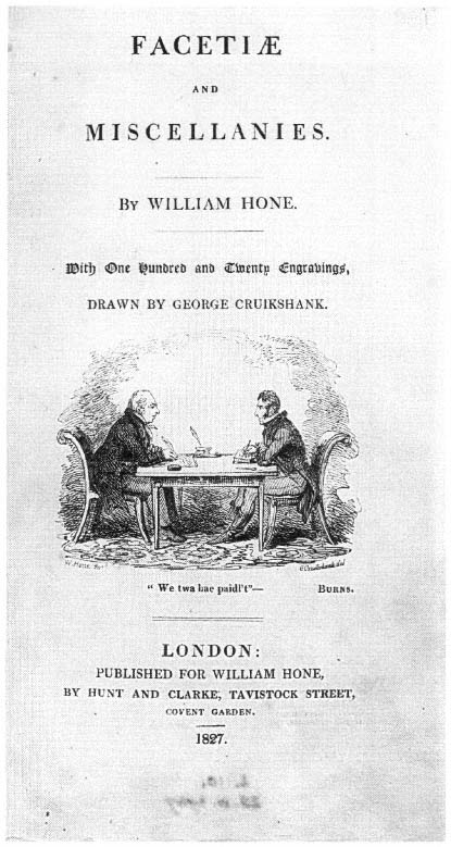
Fig. 7.
George Cruikshank, "Home and Cruikshank," in Facetiae and Miscellanies,
London, 1827. Photograph by the author, courtesy of the Board of Trustees
of the Victoria and Albert Museum.
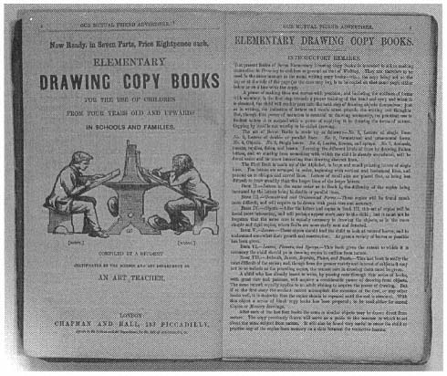
Fig. 8.
Advertisement for Elementary Drawing Copy Book s from Our Mutual Friend, no. 12 (April 1865).
Photograph by the author, courtesy of the Trustees of the Dickens House Museum.
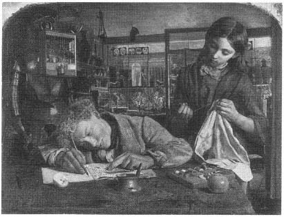
Fig. 9.
Robert Braithwaite Martineau, Kit's Writing Lesson, 1852. London,
Tate Gallery. Photograph courtesy of the Trustees of the Tate Gallery.
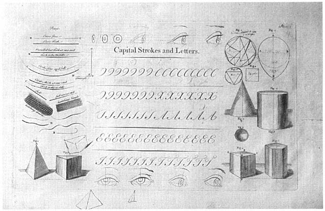
Fig. 10.
"Capital Strokes and Letters," from George Bickham, The Drawing and Writing Tutor (London: John Bowles, c. 1740),
plate 1. Photograph by the author, courtesy of the Board of Trustees of the Victoria and Albert Museum.
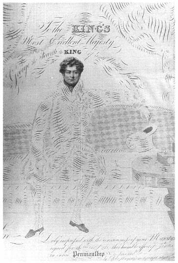
Fig. 11.
John Hemm, "George the Fourth," from Portraits of the Royal
Family in Calligraphy (London, 1831). Photograph by the author,
courtesy of the Board of Trustees of the Victoria and Albert Museum.
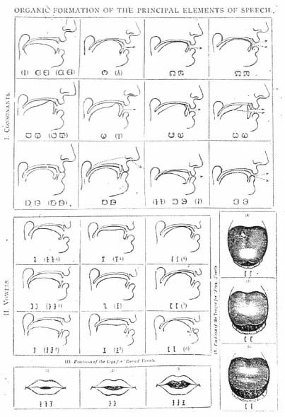
Fig. 12.
"Organic Formation of the Principal Elements of Speech," from Alexander
Melville Bell, Visible Speech, 1864. Photograph by the author, courtesy of the
Curator, Alexander Graham Bell National Historic Site, Baddeck, Nova Scotia.
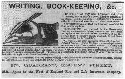
Fig. 13.
"Writing, Book-Keeping, &c.," advertisement from serial issue of Edwin
Drood, no. 5 (August 1870), 19. Photograph by the author, courtesy of the Dickens
House Museum, London.
Fig. 14.
Page from the Autographic Mirror (issued weekly from 1865), 183. Photograph
by the author, courtesy of the Board of Trustees of the Victoria and Albert Museum.
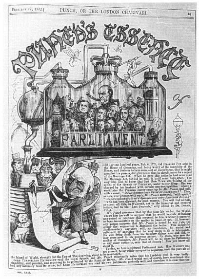
Fig. 15.
Initial letter T from "Punch's Essence of Parliament," Punch 62 (17
February 1872): 67. Photograph by the author, courtesy of the Librarian,
University of Essex Library.
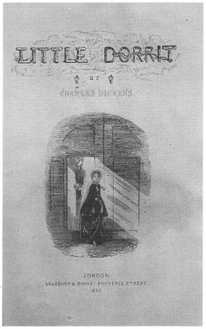
Fig. 16.
Phiz (Hablot K. Browne), title page to Charles Dickens's Little Dorrit,
serial issue nos. 19 and 20 (1857). Photograph by the author, courtesy of the
Dickens House Museum, London.
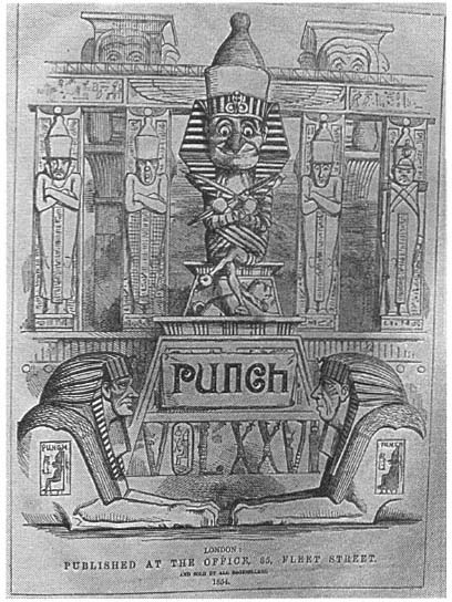
Fig. 17.
Volume cover for Punch 26 (1854). Photograph by the author, courtesy
of the Librarian, University of Essex Library.
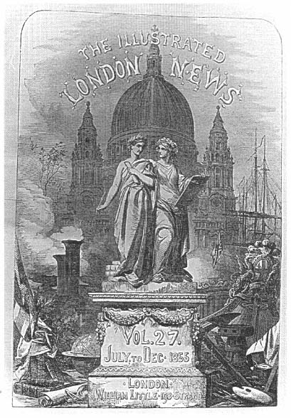
Fig. 18.
Volume cover for the Illustrated London News 27 (1855). Photograph
by the author, courtesy of the Librarian, University of Essex Library
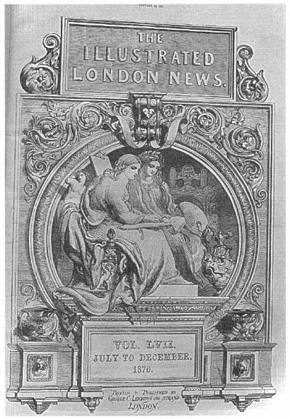
Fig. 19.
Volume cover for the Illustrated London News 57 (1870). Photograph
by the author, courtesy of the Librarian, University of Essex Library.
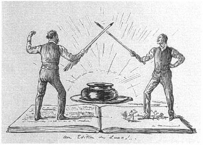
Fig. 20.
George du Maurier, "An Edition de Luxe!" Magazine of Art, 1890.
Photograph by the author, courtesy of the Board of Trustees of the
Victoria and Albert Museum.
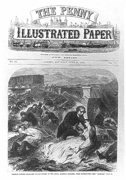
Fig. 21.
Staplehurst railway accident, cover of the Penny Illustrated Paper 9 (24 June 1865).
Photograph by the author, courtesy of the Librarian, University of Essex Library.